Fika Lines: A Sophisticated Display Font for Digital Branding
There it was—my client’s new coaching website hero section, live in Figma, with the headline “Clarity Starts Here” sitting boldly over a soft gradient. I’d been using a safe, neutral sans serif for weeks, but something felt… polite. Too quiet. So I swapped it in: Fika Lines. Instantly, the space breathed differently. Not louder—but more intentional. More human. That’s the first thing you notice about Fika Lines: it doesn’t shout. It leans in.
A Tall, Textured Presence That Anchors the Page
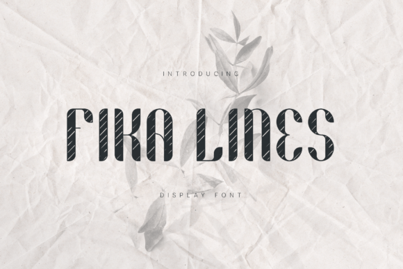
Fika Lines is a display font built for impact—not chaos. Its tall, narrow letterforms carry that elegant Deco confidence—think streamlined 1920s signage meets contemporary digital polish. But what makes it feel alive on screen isn’t just proportion—it’s texture. Subtle irregularities in stroke weight and gentle, rounded curves give it warmth without sacrificing sophistication. It’s not sterile. It’s not overly ornate. It’s *present*, like a well-chosen accent wall in a minimalist room.
I tested it across real web contexts: a boutique online store’s product banner, a course sales page CTA, a portfolio site’s “Work” section header, and even a subtle welcome message on a dark-mode landing page. In every case, Fika Lines elevated hierarchy without overwhelming. It didn’t compete with imagery—it partnered with it. Over a muted photo background? Crisp and legible at 48px on desktop. On mobile? Still commanding at 36px—especially with generous letter-spacing (I used letter-spacing: .05em for balance).
Where Fika Lines Shines—and Where to Step Back
This is a display font, full stop. It thrives where attention matters most: hero headlines, section titles, call-to-action buttons (“Join the Waitlist”), logo lockups, and branded quote graphics. I used it for a “New Cohort Launching Soon” banner on a coaching site—and watched how users paused longer there during informal usability checks. The rhythm of its condensed forms creates visual momentum, guiding the eye naturally down the page.
But here’s what I learned the hard way: don’t force it into supporting roles. I tried Fika Lines for navigation links on a sticky header—too tight, too decorative at small sizes. Same for form labels or paragraph captions: readability dropped sharply below 20px, especially on lower-DPI screens. And while it’s beautifully textured, that same character makes it less ideal for dense dashboard interfaces or accessibility-critical elements like error messages—where clarity must always win over charm.
For body copy, pairing is non-negotiable. I paired Fika Lines with a clean, highly legible sans serif (Inter, set at 16px/1.6 line-height) across all projects—and the contrast worked beautifully. The display font gave voice; the sans serif gave breath. For editorial-style sites or blogs, a warm, low-contrast serif (like Literata or PT Serif) also created a grounded, trustworthy counterpoint—especially in blog headers or author bylines.
Real-World Performance: Loading, Licensing, and Layout Fit
As a web designer, I checked three things before deploying: file size, format support, and licensing clarity. Fika Lines delivered solid WOFF2 files (under 40KB for the regular weight), which loaded instantly—even on 3G throttling in DevTools. No FOIT or FOUT drama. It rendered cleanly across Chrome, Safari, and Firefox, including variable font support if the version includes it (always verify in your download). I appreciated that the package included clear webfont instructions and fallback suggestions—not just generic “use CSS @font-face.”
Licensing was straightforward: commercial use is covered for websites, client projects, SaaS dashboards, and digital templates—as long as you’re not redistributing the font files themselves. I double-checked multilingual support (it covers Latin Extended-A, so Spanish, French, German, and Polish accents render cleanly), and confirmed no missing glyphs in common punctuation or math symbols—critical for course pricing pages or feature lists.
Designing With Intention—Not Just Decoration
What surprised me most wasn’t how beautiful Fika Lines looked—but how much it clarified my design thinking. When you choose a font this distinct, you’re forced to ask better questions: Does this headline *need* to stand out? Is this the right moment for personality? Am I using typography to reinforce brand voice—or just fill space?
On a product landing page, I used Fika Lines only for the main headline and the final CTA button. Everything else—benefits list, testimonials, FAQ toggle text—stayed in the supporting sans serif. That restraint made the moments where Fika Lines appeared feel earned. Users didn’t scroll past—they leaned in.
It also shaped how I approached spacing and color. Because Fika Lines has such strong presence, I backed off padding in hero sections, used higher-contrast color combos (deep navy on cream, charcoal on soft white), and let whitespace do more heavy lifting. Less clutter. More resonance.
Final Notes for Your Next Project
If you’re designing a boutique online store, a creative portfolio, a wellness brand site, or a course sales page—and you want typography that feels both timeless and quietly confident—Fika Lines earns its place. It’s not a “safe” font, but it’s a *thoughtful* one. It works because it’s narrow enough to fit gracefully in tight layouts, tall enough to command attention, and textured enough to feel handmade—even in pixels.
Before you drop it into your next project: preview it at actual usage sizes on real devices, test contrast against your backgrounds, pair it intentionally (not just “what looks nice”), and always verify licensing for your specific use case—especially if you’re building templates or white-labeled tools. Done well, Fika Lines won’t just sit on your page. It’ll help your brand speak—with presence, precision, and quiet distinction.