Attis: A Bold Display Typeface for Digital Impact
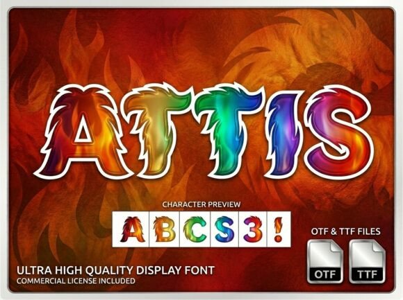
It started with a hero section that felt… safe. Too safe. I was refining the homepage for a ceramicist’s online shop — clean photography, warm tones, thoughtful spacing — but the headline just blended in. So I swapped in Attis. Instantly, the page exhaled. That massive, extra-bold white uppercase block alphabet didn’t just sit on the banner; it anchored the entire visual experience like a sculptural element carved into the layout. It wasn’t loud for the sake of noise — it was confident, untamed, and unmistakably human.
What Attis Brings to Web Layouts
Attis is a display typeface built for presence — not subtlety. Its high-impact geometry, sharp corners, and dramatic weight give it the visual authority of hand-painted signage or vintage enamel lettering, but with crisp digital precision. It’s not trying to be neutral. It’s designed to declare, to focus attention, to make a statement before the first word is read. As a web designer, I appreciate how its personality works *with* intentionality: you don’t use Attis to whisper — you use it to open a door.
Real Testing Across Devices and Contexts
I tested Attis across several live scenarios: a coaching website’s main CTA button, a portfolio site’s project title overlay on a dark image background, and a seasonal product landing page’s headline above a scroll-triggered animation. On desktop, its impact is immediate — especially at 48–72px with generous letter-spacing. But the real test came on mobile. At smaller sizes (32–40px), it still held clarity when paired with sufficient contrast and padding. Over a busy photo? Yes — but only with a subtle dark-to-transparent gradient behind the text or a tight, opaque background bar. Without that layer, the white-on-white or light-on-light version lost legibility fast.
One surprise: it performed beautifully as a decorative accent in a blog header, where “Spring Collection” appeared in Attis above a serif body font. The contrast wasn’t jarring — it felt intentional, like a gallery label next to a fine-art print. And yes, it loaded smoothly via modern @font-face declarations using WOFF2 — no visible FOIT or FOUT in Chrome or Safari during testing.
Where Attis Shines (and Where It Steps Back)
Attis excels in short-form, high-intent contexts:
- Hero headlines — especially over bold imagery or solid color blocks
- Section dividers — “Our Process”, “Work With Me”, “Limited Edition”
- CTA buttons — when sized 20–24px with ample padding and strong contrast
- Landing page feature titles — paired with descriptive subheadings in a clean sans serif
- Digital brand kits — as a signature typographic element for social banners or email headers
It’s not suited for long-form reading, navigation menus, form fields, or small interface labels. Its novelty strength becomes a liability in dense UI — think dashboard tables or filter tags. And while it handles English effortlessly, I double-checked the character set before finalizing a client’s bilingual campaign: Attis includes basic Latin-1 support but no extended diacritics or Cyrillic. Always verify multilingual needs early.
Pairing for Clarity and Character
The magic of Attis isn’t in isolation — it’s in conversation. I consistently paired it with Inter (a highly readable, open-source sans serif) for body copy, captions, and buttons. The contrast between Attis’s bold, architectural presence and Inter’s friendly neutrality created hierarchy without tension. For a more editorial feel — say, a creative writing course site — I tried pairing it with a quiet serif like IBM Plex Serif for subheads and quotes. That combination added warmth and gravitas without competing.
Avoid pairing Attis with other heavy display fonts or overly decorative scripts — it doesn’t need competition. And while it’s tempting to use multiple weights, Attis currently ships as a single bold weight. That’s fine: its strength lies in singular focus, not typographic range.
Practical Considerations Before You Deploy
Before adding Attis to a live site or client project, I always check three things:
- Licensing: Confirm the license covers web embedding (not just desktop use) — especially if the site is commercial or client-facing.
- File formats: Ensure WOFF2 is included for optimal compression and browser support.
- Accessibility baseline: While Attis passes basic contrast checks (4.5:1 minimum against dark backgrounds), never rely solely on its visual flair for critical information. Always pair it with semantic HTML and clear supporting text.
For SVG-based icons or animated text elements, I exported individual letters as vector paths — the clean geometry scaled flawlessly, even down to 16px in icon-sized contexts (though readability still required careful background treatment).
Final Note on Digital Presence
Attis doesn’t make a website “prettier” — it makes it more memorable. In a feed-saturated digital landscape, where users scroll in under two seconds, a typeface like Attis gives your message a split-second advantage: instant recognition, emotional resonance, and a clear signal of creative confidence. It’s not for every brand — but for makers, studios, and creators who lead with boldness and craft, Attis isn’t just a font. It’s a visual handshake.